FolderSizes v9.8 is here, and with it comes a visually stunning and intuitive new way to understand your disk space usage: the Sunburst Chart. This powerful new report type offers a dynamic and interactive method for visualizing hierarchical file systems, allowing you to quickly identify where your valuable disk space is being consumed.
What is a Sunburst Chart?
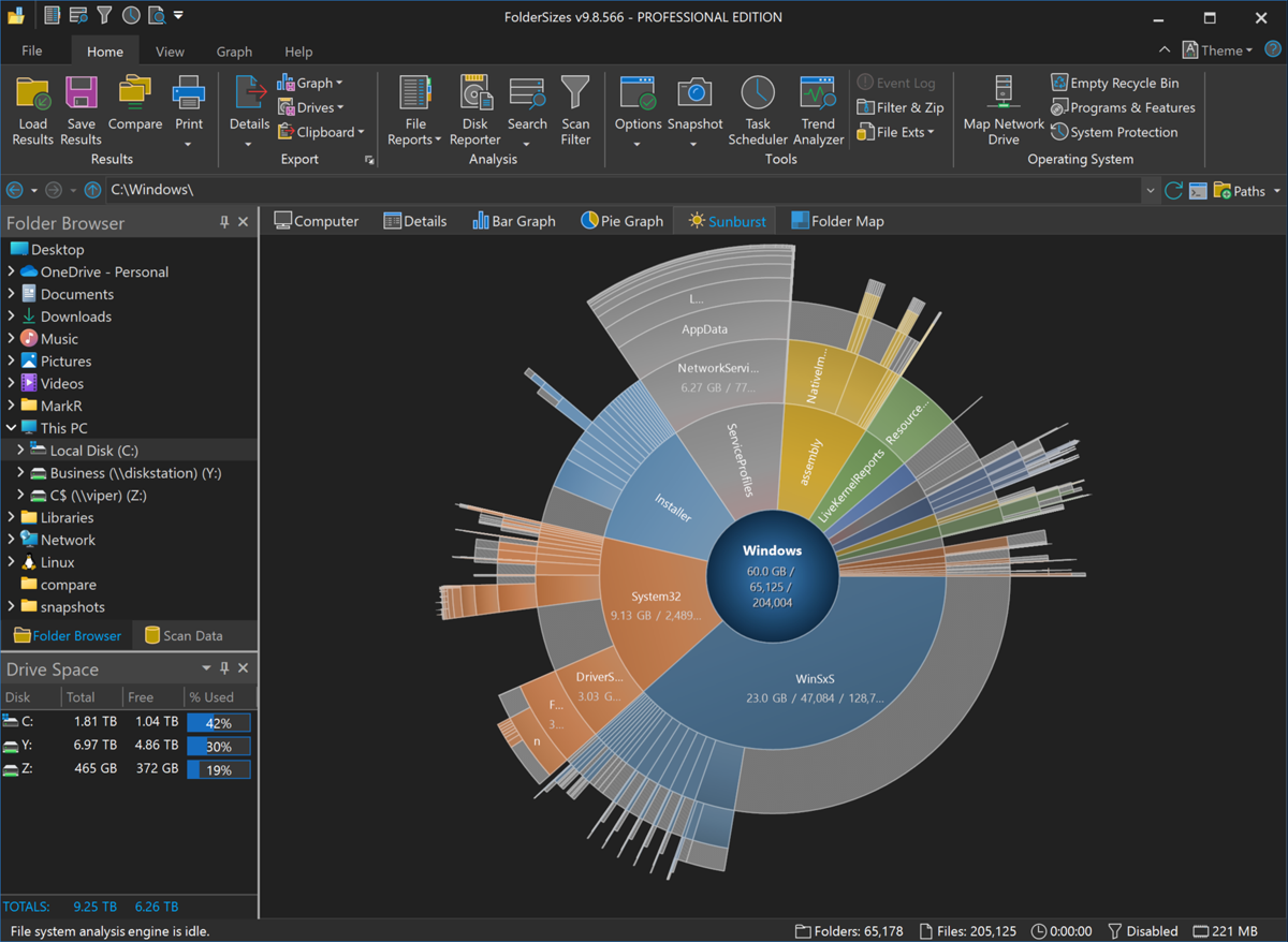
Imagine your file system, with its nested folders and subfolders, laid out in a circular, multi-level pie chart. That’s essentially what a Sunburst Chart is.
- The Center: The innermost circle of the Sunburst Chart represents the root folder you’ve selected for analysis.
- Radiating Rings: Each subsequent ring moving outwards represents the next level down in the folder hierarchy.
- Segment Size: The crucial aspect is that the size of each segment (or “slice”) within a ring is directly proportional to the size of the folder (and its contents) it represents relative to its parent. A larger segment means that folder is consuming more space.
This hierarchical, proportional representation makes it incredibly easy to spot large directories at a glance, no matter how deeply they’re buried.
How Sunburst Charts Revolutionize Disk Space Analysis
Traditional tree views and detailed listings are invaluable, but the Sunburst Chart in FolderSizes v9.8 brings a new dimension to disk space analysis:
- Immediate Visual Impact: Forget sifting through long lists of folders and numbers. The Sunburst Chart provides an instant overview. Large, space-hogging folders pop out visually, demanding your attention. The use of gradient sector fills further enhances visual clarity and aesthetic appeal.
- Intuitive Drill-Down: The Sunburst Chart isn’t just a static image. Simply click on any segment representing a folder, and the chart can re-center and expand on that specific branch, allowing you to explore deeper into its subfolder structure with the same intuitive visual cues. This makes navigating complex directory trees effortless.
- Contextual Understanding: By visualizing the entire hierarchy at once (or a significant portion of it), you gain a better understanding of how space is distributed across different branches of your file system. You can see not just that a folder is large, but also how its subfolders contribute to that size.
Key Features of Sunburst Charts in FolderSizes v9.8
Beyond its core visualization capabilities, the Sunburst Chart in FolderSizes v9.8 comes packed with practical features:
- Exporting Options: Need to share your findings or keep a record? You can easily export the Sunburst Chart to an image file (e.g., PNG, JPG) for inclusion in reports or presentations. You can also copy it directly to the Windows clipboard for quick pasting into other applications.
- Scheduled Reports: Integrate Sunburst Charts into your regular disk space monitoring routines. FolderSizes allows the Sunburst Chart to be included in scheduled reports, so you can automatically generate these insightful visuals on a recurring basis. This is perfect for tracking space consumption trends over time.
Getting Started with Sunburst Charts
Using the new Sunburst Chart in FolderSizes v9.8 is straightforward. After performing a scan of your desired drive or folder path, you’ll find the Sunburst Chart available as a new report view. Explore its interactive nature, drill down into interesting areas, and see for yourself how it can transform your approach to managing disk space.
The addition of the Sunburst Chart further solidifies FolderSizes’ position as a leading tool for comprehensive disk space analysis, providing users with yet another powerful and intuitive way to reclaim and manage their storage effectively.